
Before you bring out the pitch forks and call heresy, relax. We aren’t super big fans of Comic Sans. There’s yet to be a project we’ve worked on where using it is just right. Yes, there are projects where Comic Sans is the perfect font. Very specific niche projects.
 Here’s a brief history of Comic Sans to get us started:
Comic Sans MS, commonly referred to as Comic Sans, is a sans-serif casual script typeface designed by Vincent Connare and released in 1994 by Microsoft Corporation. It is a casual, non-connecting script inspired by comic book lettering, intended for use in informal documents and educational materials.
Today, Comic Sans MS, commonly referred to as Comic Sans, is a sans-serif casual script typeface designed by Vincent Connare and released in 1994 by Microsoft Corporation. It is a casual, non-connecting script inspired by comic book lettering, intended for use in informal documents and educational materials. Today, Connare calls comic sans “the most hated and most loved font in the world.”
In the 1980’s, there wasn’t much in the terms of fonts aside from our what Connare viewed as a sea of boring, conventional fonts. As a Microsoft typographic engineer, he wanted Comic Sans to stand out on Microsoft’s early operating system, Microsoft Bob.
Comic Sans was originally designed to be used in the talk bubbles of a dog called Rover in Microsoft Bob, but it wasn’t completed in time to make it into the release. Originally, Microsoft had used Times New Roman, but Connare saw the system font oddly unsuited and inappropriate.
The inspiration and design process of Comic Sans:
To design Comic Sans, Connare turned to the aesthetic of Batman and Watchman comics as inspiration. Connare also looked to artwork he saw in the ’80s in New York’s SoHo galleries.
Comic Sans gained so much momentum when it was released in Windows 95 that it was being used for the wrong things. From emails to business cards, the font designed for younger users was everywhere. That’s where the hate started – because it was so commonly misused. Typography is a key component in setting the tone and personality of your communication. As a result, there was a lot of poorly designed materials.
Aside from there being a bunch of hate on the font, there’s been a lot of different momentum around the idea that Comic Sans is easier for dyslexic readers. It’s estimated that 10% of the population experiences some form of dyslexia. That’s a lot of media consumers and why it’s important to keep in the back of your mind.
 There have been no formal studies to prove that Comic Sans is the best font for those with dyslexia. However, what we do know is that fonts that are sans-serif are easier for these readers. Sorry Times New Roman, but you’re out. A font that arguably shares a lot of the funky qualities as Comic Sans is OpenDyslexic. From their similarities, it’s easy to understand why people claim and believe that Comic Sans is a strong font for accessibility. Click here to download Open Dyslexic.
In today’s world of being accessible and inclusive, even if not formally proven, we think that if Comic Sans is easier for dyslexic readers to read, and if nothing else, that makes it beautiful.
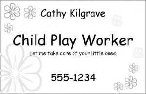
Here’s an example of where Comic Sans isn’t an appropriate font choice:

Here’s an example where Comic Sans is a great choice of font:


